Category: Site Updates

Clearing the Cobwebs

Over the past few years, this website has regressed from an infrequently updated blog to a walking corpse full of outdated information, spaghetti code, and broken links. There are many reasons for the lack of attention but there’s no need to bore you with those excuses.

Over the past few months, I’ve been working on a completely overhauled mekosh.org design and structure that will more accurately reflect my current design philosophy and the way I would like this site to function. I’ll be moving away from a blog-centric home page and incorporating my tweets, side projects, and portfolio pieces more prominently. The blog will still stick around, but it won’t be the main focus of the site.

In the five years since I launched the current design of this site, the ways we build websites and the tools I use to do so have changed substantially. The new site I’m coding is still WordPress, but it will be mobile first and fully responsive. I’ll write more about this when the new design is live, but I felt this site could use a little jolt of electricity in the meantime.
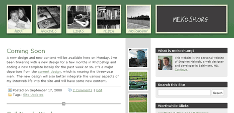
Polaroid Theme

It still needs some polish, but I think my new theme, Polaroid, can stand on its own at this point. Instead of working from the heavily modified templates of my old theme, I started with a fresh copy of the WordPress default template, making sure that I had widget capabilities for the sidebars and a few other spots. With the exception of the archives page sidebar, all of the sidebars on the site are WordPress widgets.

Eventually, I will be pulling the media section more fully into the WordPress template and convert the backend of those features into WordPress plugins. I also added a new plugin to spruce up the archives page: Compact Archives. This plugin allows you to create a neat block of date archives, similar to how Kottke.org’s archive page used to be structured.

Some pages remain mostly unstyled, including the links and media pages. There are also a few minor style issues with IE6/7, but Firefox and Safari users shouldn’t see anything out of place. Feedback is appreciated! Leave a comment and let me know what you think, good or bad.

Coming Soon

A new design and new content will be available here on Monday. I’ve been tinkering with a new design for a few months in Photoshop and coding a new template locally for the past week or so. It’s a major departure from the current design, which is nearing the three-year mark. The new design will also better integrate the various aspects of my Interweb life into the site and will have some new content.

This Is Not a Blog

I’m almost certain that the W3C prevents me from calling this site a weblog anymore. The odd thing is, with the exception of very brief periods, I don’t know if I ever ran a blog. However, when the home page shows entries that date back nearly a year (and only displays 10 posts total), something about the format isn’t working.

My life is busy. Since my last entry, I’ve moved to a new apartment, bought a new (used) car, become engaged, was promoted to Web Developer at work, and started several freelance design projects. I’m trying to simplify a lot of things in my life: clutter, diet, goals, and more, but I realize that I won’t have less to do or more time to do it unless something drastic happens. Like winning the lottery or a generous windfall from the Walton family. My goal to write shorter entries more often is clearly not working. I just don’t have the time or the interest to prioritize it.

I’m thinking about deemphasizing the blog format of this site and shifting focus to the items that have been in the sidebar for-(almost)-ever: the photos, the links, and the reading. I would really like to put together a web-based library application for myself and include that on this site. There are better ways to incorporate my photos and links than just sidelining them. And perhaps I’d have time to write up some longer article-style entries. A home page that gives equal time to all of these areas of my digital life makes more sense than antiquated weblog entries hogging the home page real estate.

Summer CSS Realign

I completely missed the Spring CSS Reboot and I wasn’t really interested in redesigning this site as the design was only three months old at the time. However, I do think that the design could use a realignment for the summer. Mostly, I just tweaked the banner and brightened up the page with some new colors, but I have a few more things that I’ll be adjusting over the next two weeks.

In addition to new colors, I’d also like to reorganize the archives page, make the media directory page somewhat useful, update the about section, and bring the movie lists into the site template. A bit too ambitious, perhaps, but definitely feasible. Comment and let me know if there are any other features/changes you’d like to see here. Thanks!

Version 2: Dune Grass

The new version of Mekosh.org is now officially live! I’ve taken to calling this site design the Dune Grass edition in deference to the Dune Grass tool I used in Photoshop to make the banner image. Dune Grass has been in the works for about two months, but as with all things on this site, it’s still a work in progress.

I think this new design is representative of my evolving sense of design goals. More often, I’m finding myself carefully measuring and planning my designs on paper and in Photoshop rather than just building them immediately in XHTML and CSS. I’m much more willing to design for aesthetics when I’m not worrying constantly about how to make it work in CSS; the worry that something won’t translate to XHTML never disappears, but it’s much less pronounced when I’m in Photoshop.

Enough with the theoretical. Dune Grass is the second major (custom) design for Mekosh.org. My first design was designed for WordPress 1.2 during the winter of 2005 and featured a snow theme that I liked, but never finished. Once I upgraded to WordPress 1.5, I was running—more or less—a default installation for the better part of a year. That’s all changing.

I think I’m finally starting to embrace this site as something permanent. For a while (or forever) I was changing domain names and hosts on a semiannual basis. Mekosh.org feels different. It’s a nice and short domain name that seems like an extension of my real life and the center of my life on the web.

Let me know what you think about the design, good or bad. Judge it on the home page, as the other pages are still works in progress.

TextDrive for Life

This site is now running on TextDrive‘s servers. I made the switch because they were running a special “Hosting for Life” promotion that will save me a lot of money in the long run; I’ve also heard a lot of good things about TextDrive and their focus on great hosting service for people who “get it.” I plan to move all of my other sites to TextDrive in the coming weeks, so there may be some downtime. I highly recommend you take advantage of VC3.

Gradual Updates

I’m making gradual updates to this site because I probably won’t have the time to devote to major changes for a few weeks. I changed the way RSS/Atom feeds are handled by using Steve Smith’s FeedBurner Plugin along with my new FeedBurner account. It’s a sweet WordPress plugin that will redirect any and all of my feed traffic to my FeedBurner Smart Feed. You’ll get all of my posts, Flickr photos, and del.icio.us links in one feed.

I also added a Flickr badge to the sidebar of the main page. I have hundreds of photos that I’d like to scan and upload into larger galleries—which would probably choke my free Flickr account—and devote the Photos page to them. The Flickr badge will make it easier to see when I’ve uploaded new pictures.

When I have a chance, I’d like to completely scrap the default WordPress template in favor of a custom design. However, that might be a few weeks or months away; right now, it’s just a thought.

Expanding the Site

Not surprisingly, adding new content to this site is pretty low on my list of priorities. It’s fun, but it takes a backseat to things I need to do. However, in between all of my obligations, I managed to come up with a few little things to add.

The first thing, a photos section, is something that I’ve wanted to do for about two years. It’s just one of those things that I put off indefinitely. Even now, I’m so cheating by including my Flickr photos with their provided script. I prettied it up a little with CSS, but there’s not much I can show in the way of commitment. But, pictures! Finally.

The next thing I’ve done is to make a links page so that I don’t have a huge list on the main page. The “Worthwhile Clicks” will remain on the home page as will the links to my other projects, but everything else is moving to the hyperlinks page. In addition to this, I’ve also tweaked the default WordPress template a little bit to make the header smaller. Sometime this spring, I want to do a full design, but I don’t have the time at the moment.

And finally, I created a new Media section for my collections of books, music, and movies. It’s far from finished, but I think it’s a nice start. The only section available, Movies, lists all of the movies I’ve seen, and many that I’d like to see. It’s going to be in progress for a while until I can add the movies I’ve watched; I’m sure that I’ll be adding movies continuously while playing catchup. I’ll also want to include more features, such as DVD’s I own and a way to sort results.

Let me know what you think about the changes I’ve made and how I can make this site even better. Thanks!

All Shiny and New

I started doing a major update for this site yesterday, but it won’t be complete for a few days. It’s likely that few noticed it, but I moved mekosh.org from JiffyNet‘s servers to DreamHost. That came about after they changed a server configuration and it broke my code again. It seems that every month I had to email them to report an error or my site was down for extended periods of time; this time, someone modified PHP so that I could no longer include files outside of my domain and then the server went down for six hours. My account on DreamHost has space for three domains and mekosh.org is only one of those.

The second major update means that this site is now running on WordPress 1.5 Strayhorn. It represents some big changes in the WordPress engine and overall design. I couldn’t be happier with how it’s working out so far. What really surprised me is how smoothly the upgrade from 1.2 to 1.5 went; once I uploaded the new files, I ran the upgrade file and I was done in 30 seconds.

There are still some major changes I need to make to this site that I don’t have time for at the moment. As much as I like Kubrick, I want to modify my design to match the WP template, so that I can switch it quickly. That entails reworking some CSS and XHTML to match it to WP’s theme style. A WordPress Codex page on upgrading 1.2 to 1.5 really simplifies the process.